About the project

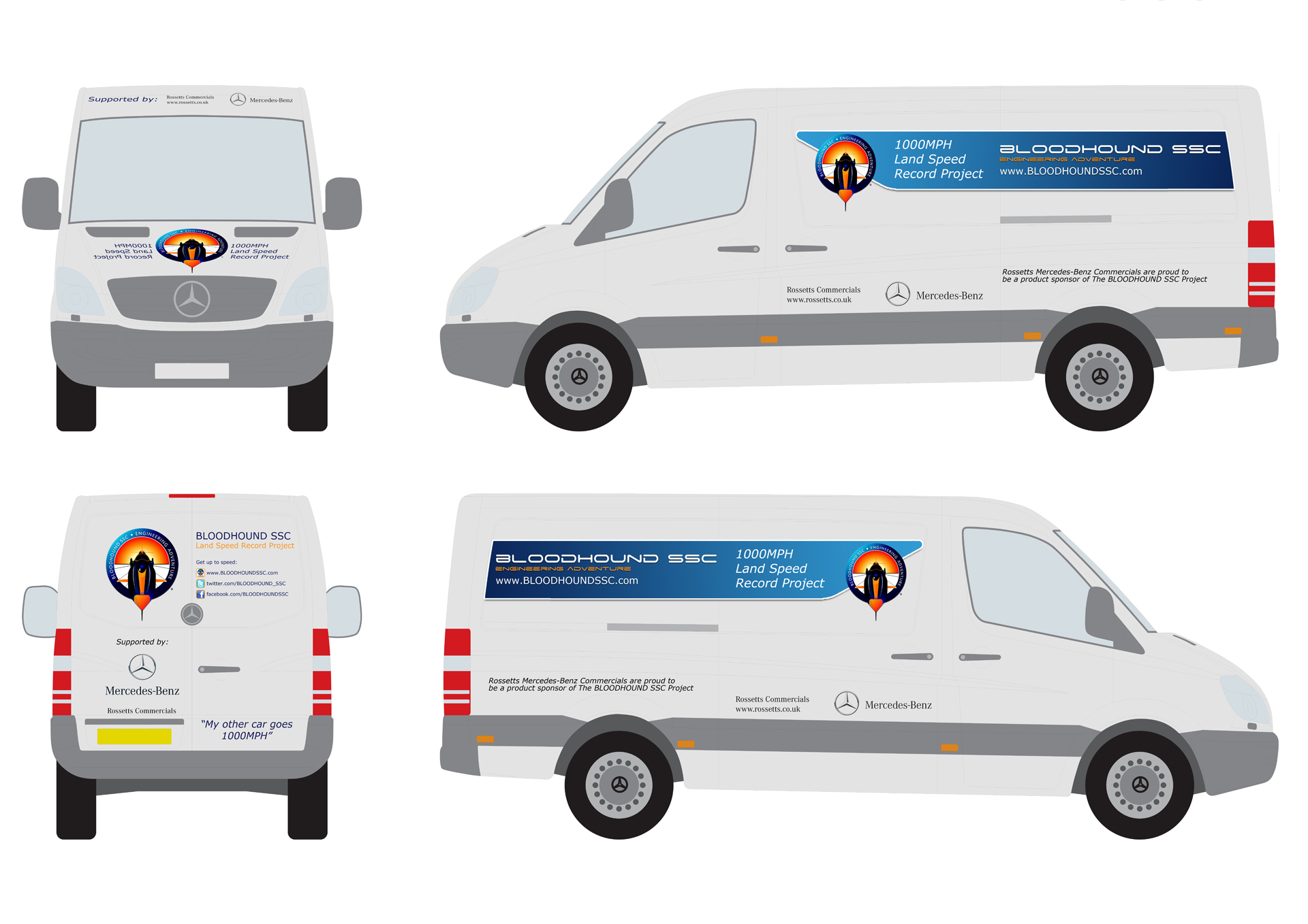
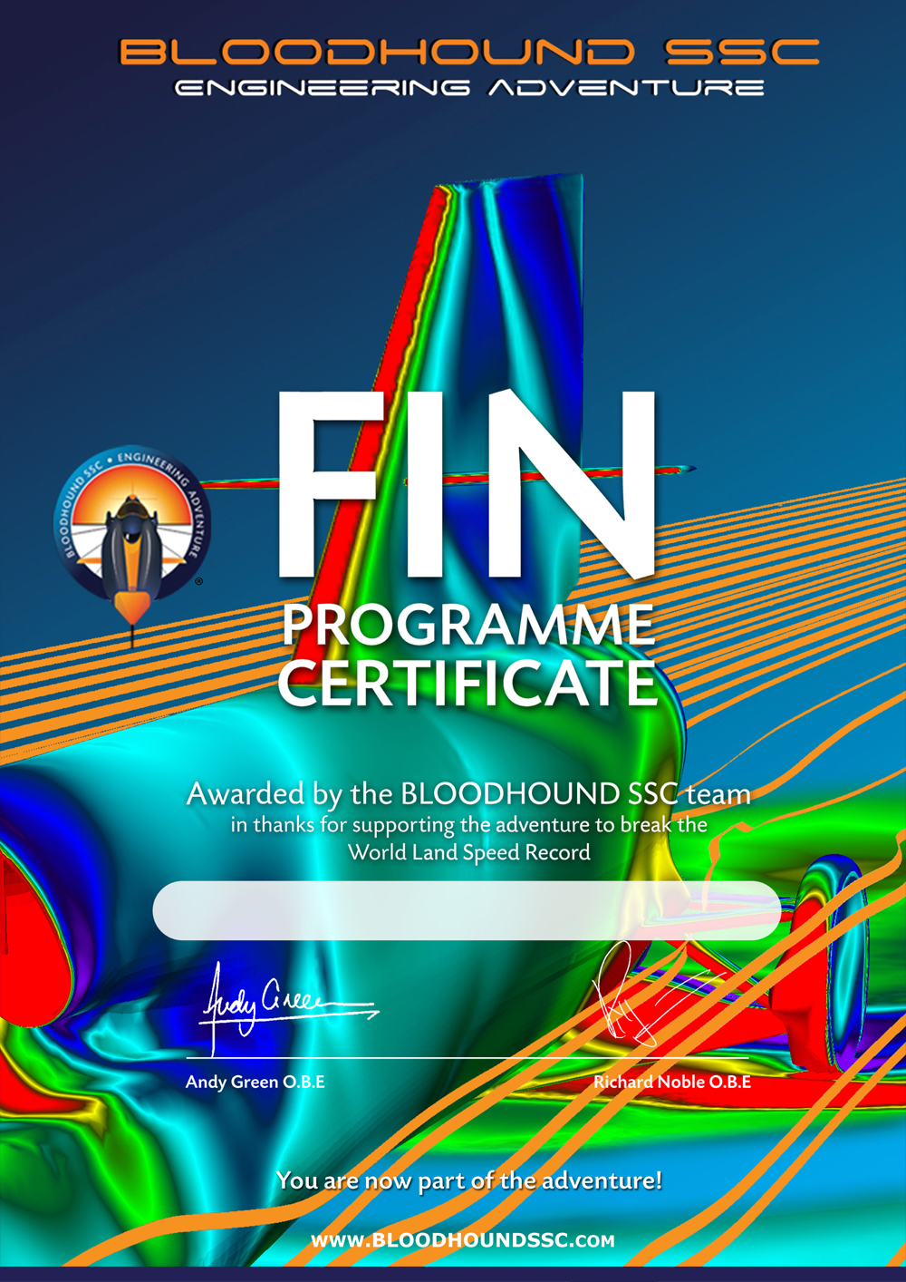
As a public project that relies on private funding, it is important that the Bloodhound SSC Land Speed Record vehicle has a unified brand identity, and is able to engage the public in an imaginative and informative way. This design language is utilised in everything from vehicles and posters through to display boards, questionnaire forms and certificates.

You can find more out about Bloodhound SSC here.

The challenge

The project needed to promote itself and the complex technological feat that it was trying to achieve. This meant that all elements of its promotion had to belong to one family.
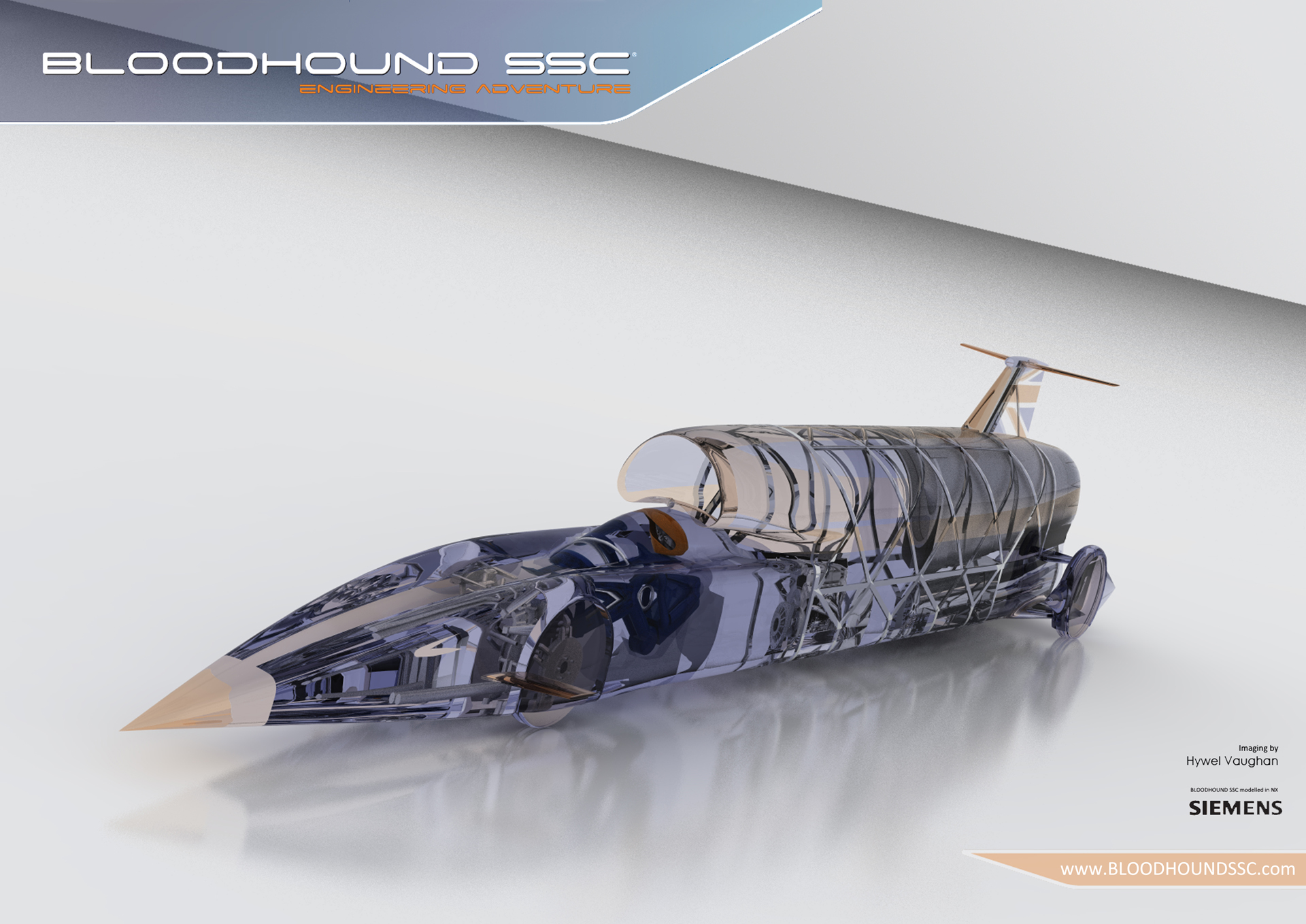
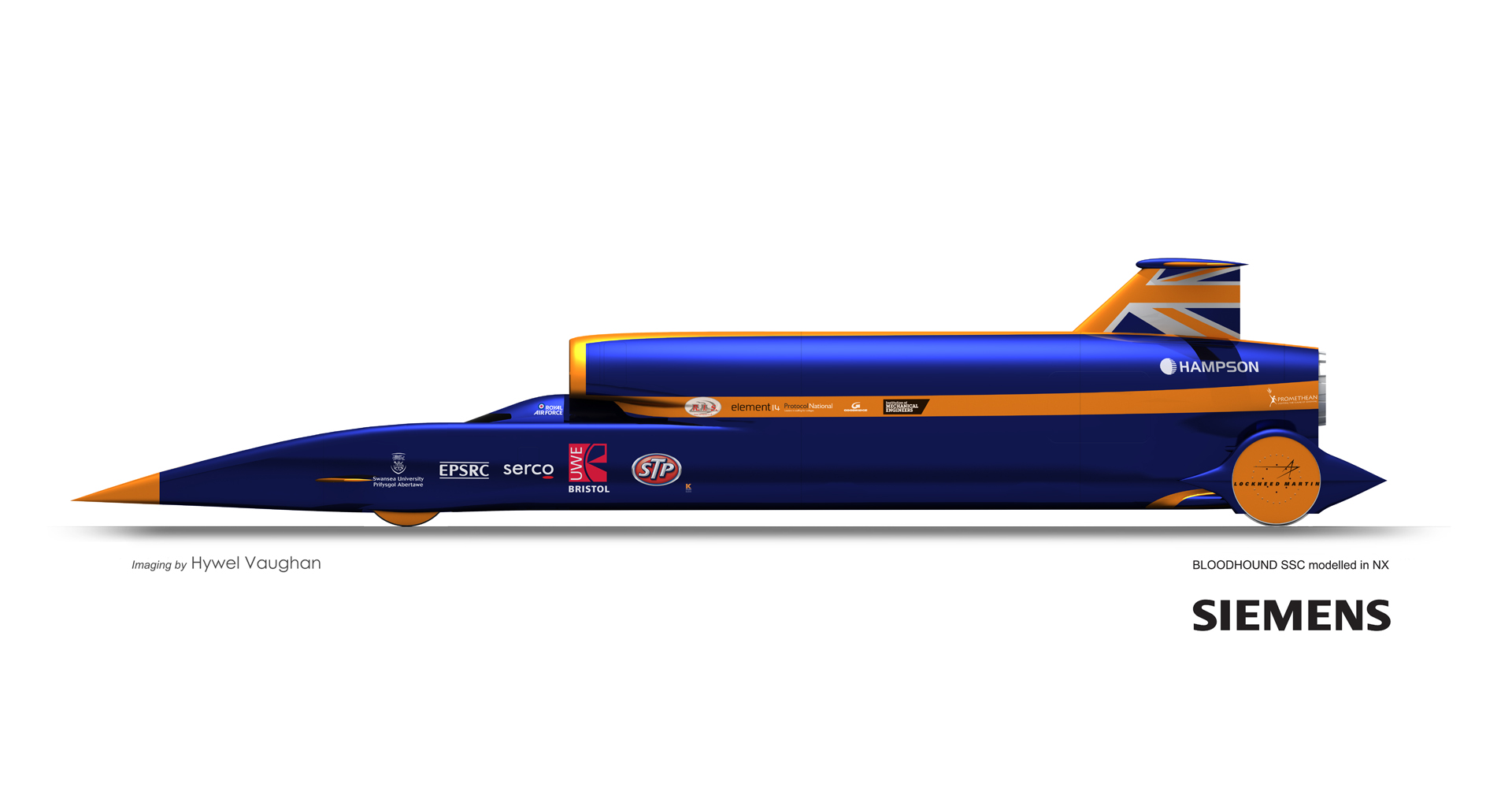
There was also a need for the actual material for the graphics, including computer renders of the vehicle and its components.

Unified brand identity

A simple and clean design language for the project needed to be pulled from work that had been done previously. This had to be recognizable and not out of place with any material that had already been produced, but also set out clear guidelines for future pieces of work.

Simple communication

With the complexity of the vehicle itself, as well as the design history behind it, there was a key challenge to make sure that all elements of the project were explained in a simple and clear manner.

The solution

The end result was a consistent and recognisable design, using key structure elements, dedicated typefaces and document layouts. The swiped angle of the headers gave the impression of speed, and the bright colours gave a feeling of excitement and opportunity.

This branding work was used in wall art (in and around the Bloodhound Technical Centre), signage (including at exhibition displays), digital graphics, merchandise and vehicles.

Work was also done to produce the material to be displayed, such as photo realistic renders of the 1000MPH car.